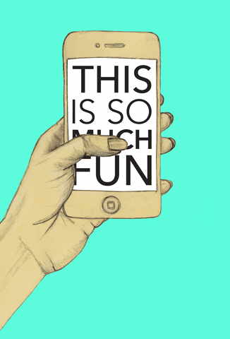
There’s something magical about the way you shop Amazon, scroll Instagram, binge Netflix, or consume your favorite digital experience.
It’s just second-nature. The subtle design nuances make for an intuitive, pleasing experience that keep you coming back time and again (probably a little too often if we’re being honest).
It’s probably not something you think about every day, but the particular style of a font, the size of a button, and the positioning of a “call to action” all influence the way you consume digital content.
We’re talking about User Interface (UI) Design.
Why It Matters
Unlike User Experience (UX) Design, which is more about the overall feeling and, well, the experience of a product, UI Design involves the specifics of the interface. It’s about how the page responds to you, and how you’re visually guided through the product’s interface. It’s both art and science.
You can’t have good UX without good UI: If UX is the thrill of Ludicrous mode 🚗💨, UI is the dashboard, the steering wheel, the infotainment system, and the seatbelts. In the context of a website, UI design covers everything from typography, color, and layout to button styling, but it all levels up to the needs of the audience. Unlike UX design, which is broader and incorporates all facets of a user’s experience, UI design is more narrowly focused on the digital touchpoints you have with a customer. And it’s never been more important.
First, it’s harder to stand out from the crowd because most modern websites are aesthetically pleasing. That’s just table stakes these days. However, site function and UI design is the critical piece that not everyone gets right—so it’s an opportunity to set yourself apart. In this era of Tik-Tok-length attention spans, UI design can be the difference between losing someone’s focus in 2 seconds or landing them as a lifelong customer. You need to provide the most helpful information, instantly, with no barriers.
Using a hierarchy of information, you can direct your audience to the most useful resources: ultimately selling more products/services and growing your business.
Making It Happen
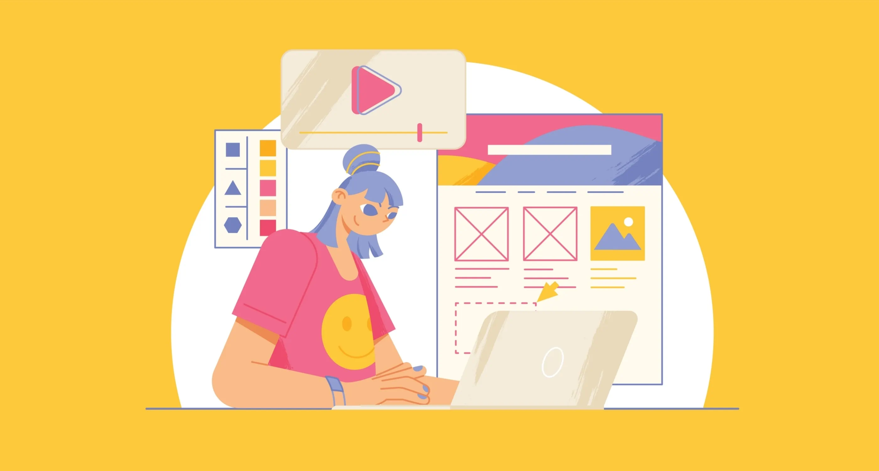
Good UI involves a bit of human psychology. As UI Designers, we have to put ourselves in the mindset of the user: Where on the screen are your eyes drawn to? How do you intuitively navigate to another page? What’s the most important information you’re seeking out?
Visual Hierarchy: The website for biotech company INT Palladium used to have all buttons sized the same. So, to emphasize certain buttons and establish a hierarchy of information, we put variable sizing in place. It seems like a subtle change—and it is!—but it makes all the difference in terms of how a user interacts with the page.
Navigation: Think of it like using wayfinding at the airport. It should be intuitive; If you’re busy thinking about what to do next, then there’s something that can be improved with design. For UI designers, the aim of the game is making a product so intuitive that navigation is second nature. To do this, we use a wireframe, showing individual pages, and a flow chart indicating which screen goes where when you click certain buttons.
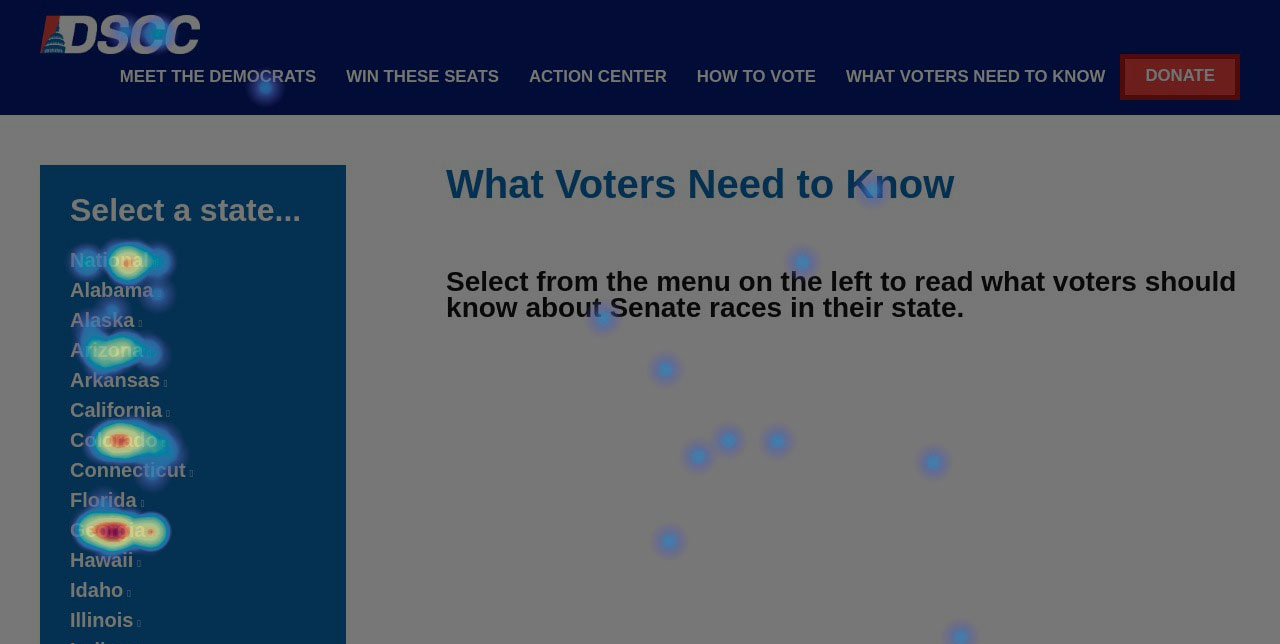
Behavior: We often use quantitative tools like Hotjar to understand a user’s click and scroll patterns on a website, proving that good UI design involves both art and science.
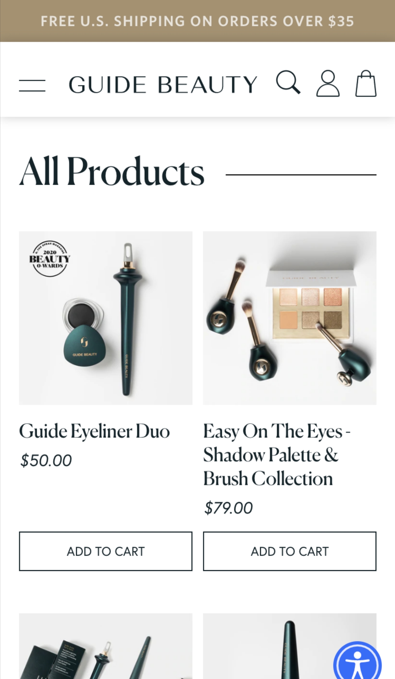
Cross-Platform: Using AdobeXD, we can connect our phones to our computers to understand how a design will look from the perspective of a smartphone user. Of course, based on how many hours we all spend staring at our iPhones, we have to consider how a website displays from a mobile standpoint (home buttons, back buttons, logout buttons, etc.).
Testing: Directly testing your customer base can give you invaluable data. One way to do this is with A/B testing, which takes the guesswork out of website optimization by using data on the performance of two or more different designs.
Close Collaboration
Unlike playing sand volleyball and drinking Mai Tais, UI design isn’t meant to be done “on an island.” It involves close collaboration with the client to truly understand the needs of their audience. This process generally includes sketching, wireframing, and mock-ups. We create a mood board. We find inspiration from your competitors—and then make yours better.
But it begins and ends with objectives. We can’t be successful until we say at baseline that we’re meeting these objectives. Are we really achieving what we want to achieve? A website isn’t meant to just look pretty.
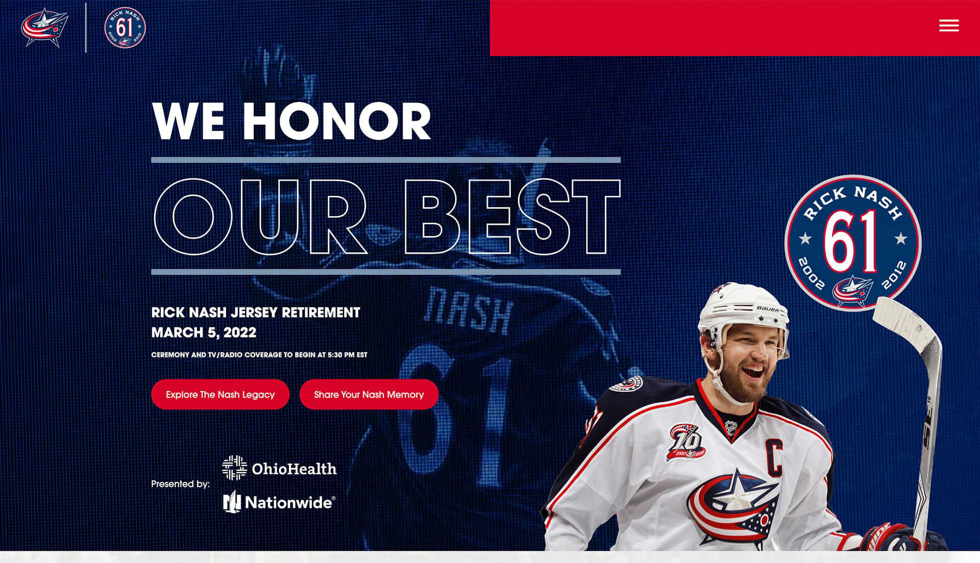
If you don’t keep objectives in mind, it’s easy to get lost in the nuance of aesthetics. Working with the Columbus Blue Jackets, we created a landing page to celebrate one of the franchise’s all-time greats, Rick Nash. It served as more of an event page and not so much to sell tickets (which is unusual for a sports team). Rather, fan engagement was key, so we made it possible for fans to upload images. The interactivity kept users engaged and scrolling down the page.
Strong UI design has led you to buy products, whether you know it or not, and it probably kept you binging and doomscrolling throughout the pandemic.
Whether your company is B2C or B2B, you need to provide intuitive, seamless, and aesthetically pleasing digital experiences for real humans.
If you’re not certain your current design is supporting your customers, consider reaching out to us for a fresh perspective. No commitment necessary. Discovery is one service we’re happy to offer, because strategizing about UI design can open up new possibilities for your business.